Retina Ready Websites
Having looked at responsive websites, the next thing that came to mind was how would all on page content including images, photos and text resize on all devices, various screen resolutions etc? How would this be achieved without without them becoming distorted, dispropotionate or unclear? The view is clear, that of industry experts – we need to look forward and into the world of ‘Retina ready website’, simple!
Let’s THINK retina ready!
Have you ever experienced blurred images and fonts, so unclear you could almost count pixels whilst browsing various websites? I’m sure you have. It is nasty and unnecessary, isn’t it? Wouldn’t it be fantastic to keep all images and text as perfectly clear as it is in reality? For those of you out there who love detail and perfection, just like me, here comes retina ready.
This technology will be used by every and all web designers in the near future. Retina ready is a product that was originally implemented by Apple, released in mid 2012 into their 15-inch Macbook Pro. Many doubters out there felt it was another ‘Mac gimic’ and would never be applied to non mac devices. Well it is looking increasing likely in 2013 all you PC fans will have access to this state pf te art technology. Check out this article…
http://www.macrumors.com/2012/04/12/intel-looking-toward-retina-display-pcs-by-2013
So what does retina really do? Without going into too many details, it helps greatly with the clarity of both images and fonts, both of which are reactive to your screen resolution. You still don’t know what that all means? Let’s have a look…!
Have a look at the image or use the link below, scroll down to the images and compare for yourself with a live preview ‘click & drag’.
http://www.apple.com/macbook-pro/features-retina 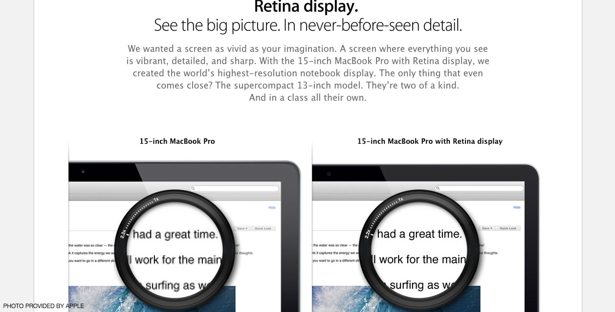
Do you think you should need glasses when looking at the images on the left for a clearer picture? Tell me how many squares and dots can you see?
Do you like what you see on the right, does it seem much clearer to you? To me it is so much better, so much clearer!
Now that the responsive design allows us to resize windows with no limits retina ready starts to make sense – double tap on the picture, make it larger or smaller and you still have the same image quality; shrink the window and fonts remain just as clear!
With a little insight to what the visual future holds, do you now think ‘I really need to bring my website up to modern standards’?